A’right. Never done a tutorial before, so I’m sorry if this is either inefficient or way too info-laden. Let’s see what I can do!
Warning: VERY IMAGE HEAVY. Not dial-up friendly.
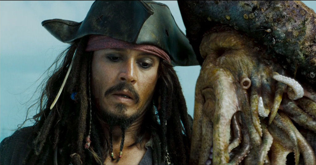
We are gonna take this picture and turn it into this:

So, start by opening the picture in PhotoShop. You’ll need to crop it—I used 10 inches by 5 inches in the cropping tool.

And this is how I cropped it, but you can do whatever size and any crop you want.

After cropping, go to Image and click on Image Size.

The size I chose was 500x250 pixels. Make sure “Constrain Proportions” is checked and type “500” in the Width selection under Pixel Dimensions.

The image is still zoomed out, though, so Zoom it to 100%.

Now that it is sized appropriately, go to Filter, roll the mouse over Sharpen, and click Sharpen in the menu that pops up.

See the difference?
Before:

After:

It’s a little too sharp, however, so go to Edit and click Fade Sharpen.

The picture is a little dark, isn’t it? So go to the Mode menu and select Screen. That’ll make it brighter.

So, now we fade the sharpening. I chose 75%.

Before:
After:

However, the screening obviously bleached the colors a little, so now we change that. Click Layer and select Duplicate Layer, and click OK when prompted. Now you’ve got two layers.


Be sure that the duplicate layer is selected, and click the Mode menu. Select Soft Light.

Before:
After:

Well, it sharpened the colors, but they are now too sharp. Time to mellow them out a little. Go to the Filter menu, and roll the mouse over Blur. Select Gaussian Blur from the menu that pops up.

I prefer the 100 pixel radius. 250 pixels caused it to be a little too light blue.

That looks much better.
Before:
After:

Now we’re going to accent some of the colors. Go to Layer, roll the mouse over New Fill Layer, and select Solid Color.

When prompted, click the Mode menu and select Exclusion. Click OK.

The color I use is 00001F. Here’s the color sample.

Before:
After:

Too blue. Let’s toss in some warmth now. Select a new solid color fill layer. However, this time, select Color Burn as the mode. I use the color FFF7E5. Here’s the color sample.
Before:
After:

Now we adjust the color even further. Select Layer, and roll the mouse over New Adjustment Layer. Select Color Balance. Click OK when prompted.

The color scheme I chose was Cyan: -20, Magenta: -10, and Yellow: -10.

Before:
After:

Here’s my favorite part. Select Layer, and roll the mouse over New Adjustment Layer. Select Curves. Click OK when prompted.

Here are the curves I selected. You can change the curves to whatever you prefer.


Before:
After:

Now we go to Brightness and Contrast. Select Layer, and roll the mouse over New Adjustment Layer. Select Brightness/Contrast. Click OK when prompted.

Again, you can select whatever levels you prefer, but these were the levels I chose. Brightness: +20 and Contrast: +5.

Before:
After:

Time for Saturation and Hue. Select Layer, and roll the mouse over New Adjustment Layer. Select Hue/Saturation. Click OK when prompted.

These were the levels I chose. Hue: 0, Saturation: +9, and Lightness: +3.

Before:
After:

We’re done with the layers, so select Layer and click Flatten Image.

Now all the layers are one image. Select Image, and roll the mouse over Adjustments. Click Shadow/Highlight from the menu that pops up.

These were the levels I chose. Shadows: 15% and Highlights: 5%.

Before:
After:

Now, this is optional, but I like using it. Select Image and roll the mouse over Adjustments. Click Variations.

I usually make sure it is a very Fine variation, and, after making sure it’s set on the original picture by clicking Original, click More Cyan and More Blue once each.

It looks nicer to me.
Before:
After:

And now we reach a very important part. Click the Blur tool over on the toolbar.

Right-click in the picture and select a round brush that is five to eight pixels wide.

And then just start touching up Jack’s face as much as you like. Be careful not to blur his features together, and it’s best to leave Davy Jones completely alone—if the features are meant to be rough and jagged, don’t blur them at all. This makes the face smoother and blends the colors and highlights together.
Before:
After:
And now you’re done with the picture. You can add a border to it, shapes, or text. I always save pictures as PNGs. What seemed like almost nonexistent changes added to the picture in the long run, and it went from this:
To this.
I hope it’s been helpful and not confusing! Feel free to play with any of those steps. That’s how I learned how to use PhotoShop in the first place—found a tutorial and just started fiddling. Enjoy!
Warning: VERY IMAGE HEAVY. Not dial-up friendly.
We are gonna take this picture and turn it into this:
So, start by opening the picture in PhotoShop. You’ll need to crop it—I used 10 inches by 5 inches in the cropping tool.
And this is how I cropped it, but you can do whatever size and any crop you want.
After cropping, go to Image and click on Image Size.
The size I chose was 500x250 pixels. Make sure “Constrain Proportions” is checked and type “500” in the Width selection under Pixel Dimensions.
The image is still zoomed out, though, so Zoom it to 100%.
Now that it is sized appropriately, go to Filter, roll the mouse over Sharpen, and click Sharpen in the menu that pops up.
See the difference?
Before:
After:
It’s a little too sharp, however, so go to Edit and click Fade Sharpen.
The picture is a little dark, isn’t it? So go to the Mode menu and select Screen. That’ll make it brighter.
So, now we fade the sharpening. I chose 75%.
Before:
After:
However, the screening obviously bleached the colors a little, so now we change that. Click Layer and select Duplicate Layer, and click OK when prompted. Now you’ve got two layers.
Be sure that the duplicate layer is selected, and click the Mode menu. Select Soft Light.
Before:
After:
Well, it sharpened the colors, but they are now too sharp. Time to mellow them out a little. Go to the Filter menu, and roll the mouse over Blur. Select Gaussian Blur from the menu that pops up.
I prefer the 100 pixel radius. 250 pixels caused it to be a little too light blue.
That looks much better.
Before:
After:
Now we’re going to accent some of the colors. Go to Layer, roll the mouse over New Fill Layer, and select Solid Color.
When prompted, click the Mode menu and select Exclusion. Click OK.
The color I use is 00001F. Here’s the color sample.
Before:
After:
Too blue. Let’s toss in some warmth now. Select a new solid color fill layer. However, this time, select Color Burn as the mode. I use the color FFF7E5. Here’s the color sample.
Before:
After:
Now we adjust the color even further. Select Layer, and roll the mouse over New Adjustment Layer. Select Color Balance. Click OK when prompted.
The color scheme I chose was Cyan: -20, Magenta: -10, and Yellow: -10.
Before:
After:
Here’s my favorite part. Select Layer, and roll the mouse over New Adjustment Layer. Select Curves. Click OK when prompted.
Here are the curves I selected. You can change the curves to whatever you prefer.
Before:
After:
Now we go to Brightness and Contrast. Select Layer, and roll the mouse over New Adjustment Layer. Select Brightness/Contrast. Click OK when prompted.
Again, you can select whatever levels you prefer, but these were the levels I chose. Brightness: +20 and Contrast: +5.
Before:
After:
Time for Saturation and Hue. Select Layer, and roll the mouse over New Adjustment Layer. Select Hue/Saturation. Click OK when prompted.
These were the levels I chose. Hue: 0, Saturation: +9, and Lightness: +3.
Before:
After:
We’re done with the layers, so select Layer and click Flatten Image.
Now all the layers are one image. Select Image, and roll the mouse over Adjustments. Click Shadow/Highlight from the menu that pops up.
These were the levels I chose. Shadows: 15% and Highlights: 5%.
Before:
After:
Now, this is optional, but I like using it. Select Image and roll the mouse over Adjustments. Click Variations.
I usually make sure it is a very Fine variation, and, after making sure it’s set on the original picture by clicking Original, click More Cyan and More Blue once each.
It looks nicer to me.
Before:
After:
And now we reach a very important part. Click the Blur tool over on the toolbar.
Right-click in the picture and select a round brush that is five to eight pixels wide.
And then just start touching up Jack’s face as much as you like. Be careful not to blur his features together, and it’s best to leave Davy Jones completely alone—if the features are meant to be rough and jagged, don’t blur them at all. This makes the face smoother and blends the colors and highlights together.
Before:
After:
And now you’re done with the picture. You can add a border to it, shapes, or text. I always save pictures as PNGs. What seemed like almost nonexistent changes added to the picture in the long run, and it went from this:
To this.
I hope it’s been helpful and not confusing! Feel free to play with any of those steps. That’s how I learned how to use PhotoShop in the first place—found a tutorial and just started fiddling. Enjoy!